Wednesday, 6 September 2017
Monday, 3 July 2017
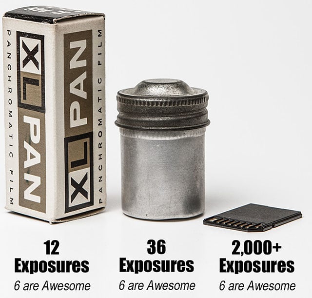
Photobucket is leaking badly.
I've been using Photobucket for a long time, certainly more than 10 years, and have even paid for a bandwidth upgrade a couple of years back. I was a fan for the greater speed over Flickr, the easy way it displayed catalogues of images (again, at the time a long way ahead of Flickr) and for the general ease of use.
Last week all that changed.
Things had been going downhill for a while, I was aware of that, with increasingly intrusive advertising, the site getting slow and not always displaying newly uploaded images. There was a road bump too, where they wouldn't offer users an ad-free option for visitors to a users site, even if that user paid a premium, so I many others looked elsewhere for somewhere to host galleries which cost them business. But I'd been wondering about paying for a subscription in order to get a bit more speed, aware that I'd not paid anything recently for hosting.
Then one day last week I heard that they no longer hosted images linked for display on external websites.
Including my images.
And they want $400 per user to restore that linking.
I've read a lot of muttering about this, varying from suggestions that this is blackmail through to wishing harm to PB employees and for the site to disappear. It's certainly a damn nuisance - I won't be paying them $400 which means that there will be lots of gaps in my personal blog and a fair number in this one until I get the images hosted elsewhere - not something I'll be doing for older posts. It's also puzzling behaviour, because there were so many things they could have done to monetise this effectively much sooner than this, and the internet is an unforgiving place with a long memory.
So I'm sad to see them go. This may also be the catalyst I and many others need to start hosting photos in my own online space: I'm not sure how much automation and how much coding is required to do so at this stage, so it may not get further than wishful thinking. It just seems a very strange and un-necessary way to commit commercial suicide.
Wednesday, 14 June 2017
The never-ending challenge.
A while back I posted this picture on my personal blog.
So Tuesday last week we returned from an 8 day trip to Israel, during which time between 2 of us we took around 2500 pictures, and I'd say this meme is very close to true - there's probably 8 to 10 great images, plus another 30 I like. The thing is, this is not new territory for me, and in the last 3 holidays I've returned with 1500-2000 images each time.
What to do with so many images?
The first time we went away and I tried to seriously photograph stuff was 2014 in Canada, but back then my science business was running down, and I was actually happy to have the processing work to keep me busy while things were quiet and I was deciding what direction to take next. After our 2015 trip to Andalucia I had full time employment, and made a really determined effort over several weeks to select and process the images. It felt like a mammoth task, and I was really glad to have finished it.
However last years pictures from Turkey were a different story. A combination of crisis of friends, personal busyness, a desire to take fresh images and a little disillusionment with image quality from a crop-sensor camera means that our 2016 holiday pictures are half sorted & half processed, still waiting for completion. It felt like the never ending challenge in the title of this post, and an almost insurmountable obstacle.
This year I selected and processed all our travel pictures within the first week of returning.
Really?
How?
There's no magic answer, no 'do these 3 steps for instant satisfaction', but there were a few key things that made all the difference. Here is a quick look at them:
1) Get it right in camera.
When I see this said on web forums it makes me groan, however there's some truth in it. A big problem for me with many landscape travel pictures that I have generated is that the sky is too bright and the landscape too dull. At the same time I utterly abhor the crude use of graduated filters that darken hill tops and vegetation that sticks up into the darker part of the filter. For the photos I took in Spain I actually developed 2 graduated filter settings in Lightroom called Spanish Landscape Boost and Sky Recovery, and they were very carefully applied to almost every landscape shot I took, which takes lots of time.
However I do have a polariser.
This stayed attached to the main lens of my camera for the duration of the trip, being carefully adjusted for almost every shot to balance sky and foreground. The bright conditions and decent sensor of the Nikon D610 I used meant that I could run at ISO400 all the time in normal daylight while using an aperture around f11 and still getting a useful shutter speed to stop blur. Occasionally I'd use a different lens (like the shots around Ein Gedi - 21-35mm Sigma) and for these I sometimes had to break out the graduate presets in post processing.
The result of this was less time needed to process each image, less careful, slow fiddling about.
2) Get it right in camera.
I nearly missed repeating that until I remembered the extra preparation I put in before we went. The camera had not been behaving exactly as I wanted, so I did a reset and then went through the camera menu, sorting out and resetting variables as I wanted them. Nikon's menu system isn't intuitive, and I discovered that when I'd though I had set spot metering previously, actually I had 12% centre weighted. So I went back and set spot metering properly, because that's how I work best, knowing that I'm choosing what the camera meters from instead of letting it best-guess. I also set exposure compensation 1/3 under to reduce blown highlights and gently bump shutter speeds up.
This meant fewer badly exposed images (still happened sometimes) and less work in post.
3) Apply basic setting to every image.
When I processed the Spanish images I took the view that each image needed individual treatment. Perhaps, but those few extra seconds multiplied by 1000 add up to a lot of time and energy. A professional acquaintance from the online world uses Capture One instead of Lightroom, because it has fewer sliders and settings, and the default processing of an image is more nearly 'right' instead of presenting the user with a lot of powerful options and a blank canvas. The advantage is that it allows him to get work to the client faster, saving him money and time.
So I know with the D610 that there are certain lightroom adjustments that *almost* every image will need, so after importing all the pictures from one camera I selected a 'typical' landscape shot and made my basic adjustments to make it look OK: Chromatic aberration, noise reduction, sharpening, highlights and shadows, clarity. I did the same thing for Chris's Olympus E-M10, though using different values tailored to a typical image from her. Now instead of going though the lens corrections and detail sections of the develop module, I can go straight to the basic section, and some of the sliders there are already where they need to be. Much time saved, and less laborious fiddling on each image.
4) Cull anything not interesting.
I shoot lots of stuff 'just in case', often because it's looks good through the viewfinder and sometimes because if I don't then it will be too late, because I'll never be there again. Just because it looks good in the viewfinder doesn't mean it will be great as a photograph on screen. If it can't justify itself as a record shot (slightly dull or poorly composed but a useful reminder) then it goes. I also shoot the same scene lots of times because I shake a bit. Multiple shots of the same scene all of similar merit? Pick the first one that's sharp.
5) Set aside the 'arty specials'.
There's a bunch of pics that I want to do some special processing on. They just got bashed through as normal, ready for me to come back at a later date and spend the time needed to do a good job. Throughput is the name of this game.
6) Try to avoid the need for any other special processing.
If the image doesn't NEED tone curve adjustment, straightening, extra noise reduction, extra sharpening, split toning, manual lens correction etc then DON'T DO IT. Process as fast as reasonably practicable.
7) Get your head down & get on with it.
It probably took around 15 hours, possibly more, to sort and process down from 2500 to around 1000 images. I didn't visit forums where I would read & chat, didn't watch movies, DID work to midnight a few times, spent several hours on both Saturday and Sunday, worked through lunch breaks too, just to finish another 20 or 30 pictures extra.
The only way to do it is to do it - and the longer it gets left, the less enthusiasm and energy there will be to process a bunch of stale, out of date pictures.
Anything else?
It's been interesting processing images from the Olympus with its tiny M43 sensor alongside the D610 with full frame sensor. Now that I've sorted out the quite terrible shutter shock problems with the E-M10 (that's another post) then images that had been correctly exposed in bright sunlight were sharp & clear and often hard to tell apart. That's a big credit the Olympus, although I was using the D610 at ISO400, which does boost the noise a bit. However if shadows needed lifting much or high ISO values were needed then the little Olympus lost out noticeably.
Now I seem to have some images of The Flying Scotsman to process. :-)
Wednesday, 26 April 2017
What we think is photography
.... is only the first step.
I wonder how many photographic journeys never actually reach an end.
A photographic print.
OK, I'm old. I can still remember how the chemicals smelled when I printed monochrome in my bathroom here, timing exposure by the immersion heater clock ticking, how my hands would smell too after getting careless fingers in the open baths.
Chemicals for colour printing didn't smell the same, warmer & softer - less biting, but were probably more toxic. I can't remember the smell of CIBAchrome chemicals at all, since this was the first printing method I learned in the mid 80's, and only ever printed 3 or 4 images at home.
This isn't about nostalgia.
I just ordered a bunch of prints, and the 12x8s arrived today. A photograph isn't real *for me* until it's been printed and I can hold it in my hand, move it between light sources of frame it and hang it on the wall. It's at this point you discover that the image that looks quite good on a backlit screen is a bit dull, or contains unbalanced blocks of light or dark, or perhaps isn't half as good as I thought it was.
Dark prints are especially difficult to get right. There's no transmitted light to bring out subtle details from shadows, so all those dark areas just block up and go dull. Strongly saturated single colours can just go 'off' a bit, making rape/canola a mustard colour instead of luminous yellow, reds turn pink & lose detail, greens go nuclear-fallout. This time the 2 mono images I had printed came back very dull & lacklustre, without any sparkle at all, and little sense of depth or texture.
There were a few images I was happy to mount & hang, replacing the prints from last year with something brighter, more exciting, more fun and a reminder of the summer to come. There's also some 16x8 panoramic canvasses on their way - I hope at least 2 of them are strong enough to use.
Tuesday, 14 March 2017
Your art is rubbish!
I seem to have become increasingly mono-oriented since late last year, possibly as a response to winter and a general lack of inspiring colours around. There has been an exception with the Joyful Woods series and I did process some of the North Devon work in colour, but those are an exception. To see my iamges have a look here.
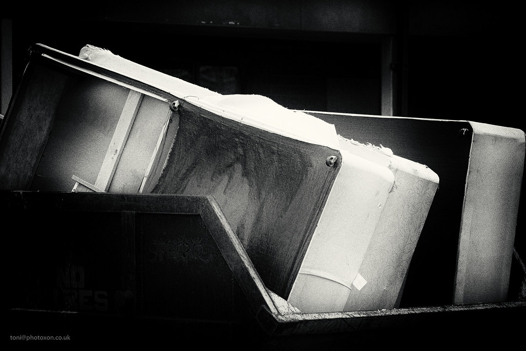
Walking around the site here last week I came across some beds that were being thrown out, and seeing shapes just calling out for a mono treatment I had to grab the camera.
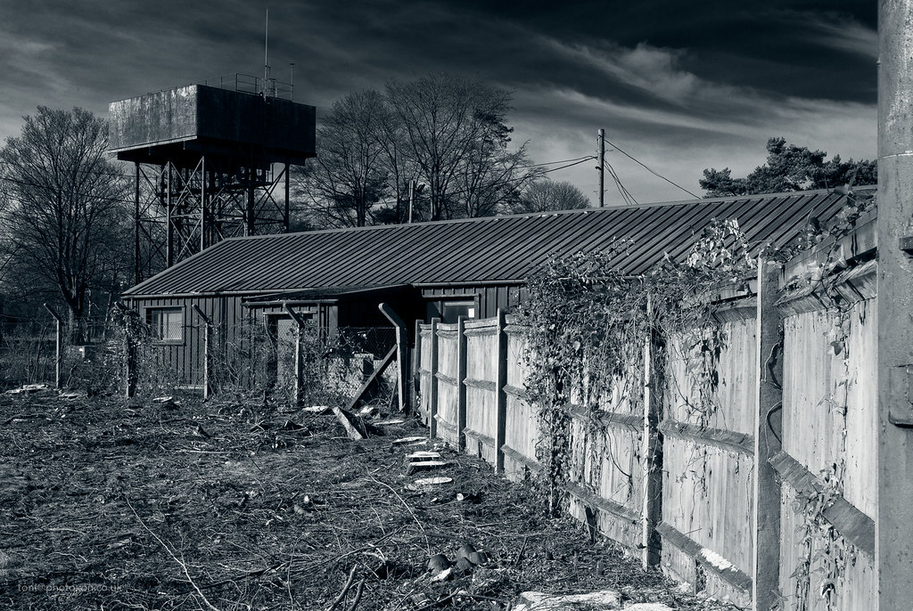
I also have a series from around the airbase, taken to at least partly document the changes to the site as building work progresses and more and more infrastructure is removed.
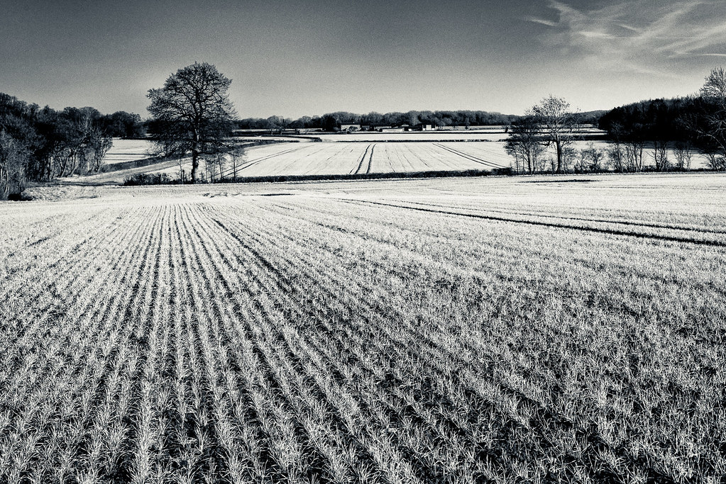
And then finally I managed to process some of the pictures taken back boxing day, when Chris and I went for a walk expecting to find a pub open, only to discover that everywhere was shut and so went hungry until we got home.
All pictures taken using a Nikon D610 and either manual 28mm 85mm and 135mm lenses or Nikon AFD 50 f1.8, basic processing in Lightroom and conversions in Nik Silver Efex and On1 Perfect Effects.
I hope this looks OK - Blogger and Flickr seem to refuse to play together well at the end of this slow connection, but apparently looks OK when viewed on other equipment. I've wondered if it's an attempt by Blogger to mae people upload their images instead of remote hosting, but I'm reluctant to do that except for those with minimal commercial value. *Just seen Blogger's embedding notice - I shall have to do something about that.
Walking around the site here last week I came across some beds that were being thrown out, and seeing shapes just calling out for a mono treatment I had to grab the camera.
I also have a series from around the airbase, taken to at least partly document the changes to the site as building work progresses and more and more infrastructure is removed.
And then finally I managed to process some of the pictures taken back boxing day, when Chris and I went for a walk expecting to find a pub open, only to discover that everywhere was shut and so went hungry until we got home.
All pictures taken using a Nikon D610 and either manual 28mm 85mm and 135mm lenses or Nikon AFD 50 f1.8, basic processing in Lightroom and conversions in Nik Silver Efex and On1 Perfect Effects.
I hope this looks OK - Blogger and Flickr seem to refuse to play together well at the end of this slow connection, but apparently looks OK when viewed on other equipment. I've wondered if it's an attempt by Blogger to mae people upload their images instead of remote hosting, but I'm reluctant to do that except for those with minimal commercial value. *Just seen Blogger's embedding notice - I shall have to do something about that.
Tuesday, 28 February 2017
To Infinitree (and beyond).
I inherited my fathers love of playing with words and the art of the pun, so the name for this was un-avoidable.
Infinitree
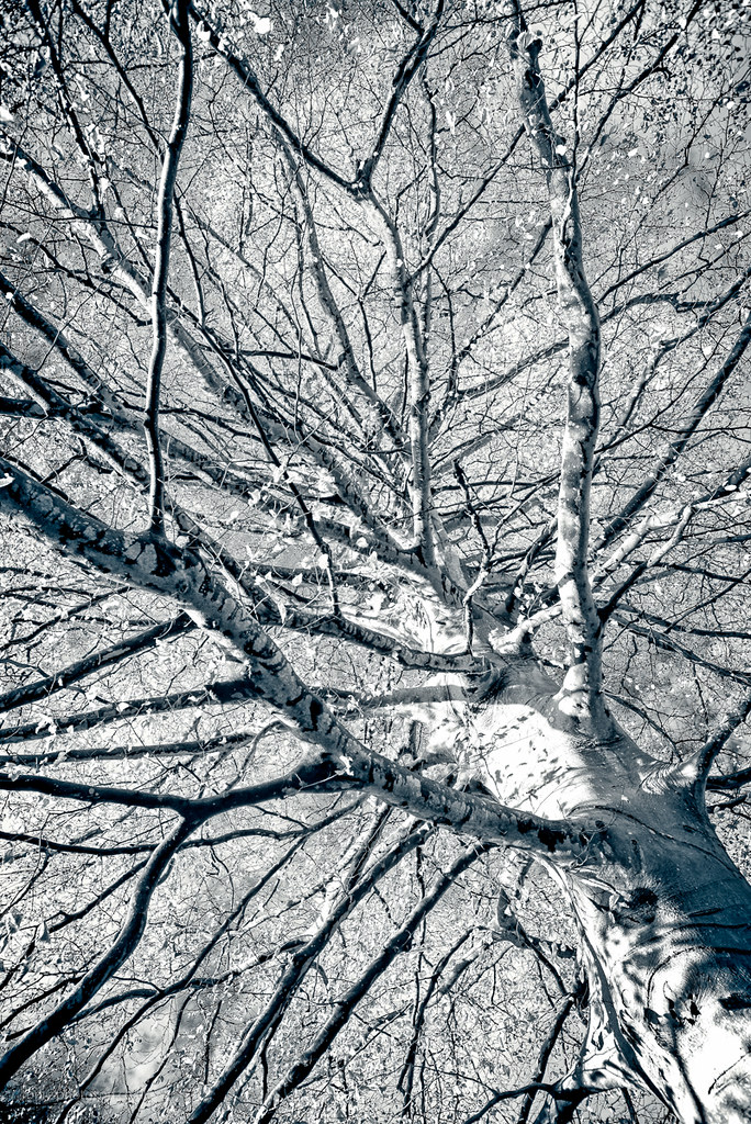
It looks a little crunchy here, thanks to a slightly soft lens, sharpening and then resizing and finally web presentation, but that's OK. Shot at Lacock abbey (home of William Fox-Talbot) in mid December, the trunk was really a fairly bright green, and by mild abuse of chrominance sliders in Perfect Effects, the green was adjusted to appear white like silver birch bark, while the sky was darkened.
Shot using a Nikon D610 and Sigma 21-35 zoom at 21mm (hence the slight softness).
Infinitree
It looks a little crunchy here, thanks to a slightly soft lens, sharpening and then resizing and finally web presentation, but that's OK. Shot at Lacock abbey (home of William Fox-Talbot) in mid December, the trunk was really a fairly bright green, and by mild abuse of chrominance sliders in Perfect Effects, the green was adjusted to appear white like silver birch bark, while the sky was darkened.
Shot using a Nikon D610 and Sigma 21-35 zoom at 21mm (hence the slight softness).
Thursday, 23 February 2017
There's no substitute for a good lens
People who read TBOTAM will know that we went away a couple of weekends ago to north Devon, and I ended up shooting a lot of rocky beach pictures. The weekend was all about my wife & her birthday, so I whacked on an old Nikon 28-85 AF zoom and just grabbed a few pictures as the scenery went past, rather than taking my time, changing lenses and carefully composing.
When we got back I was generally quite pleased with what I had at first sight, but then came the processing. The Nikon zoom isn't bad, but it's a long way from great too. The original colour images had very soft contrast due to spray and an overcast sky, and the lens also lent a softness simply because it's not dead sharp at any aperture. I felt fairly pleased with the results in Nik Silver efex, but had to push the tonal range and sharpness/structure of the images HARD to bring out textures and and shapes in the rocks, and it's degraded the images a little on subsequent viewing.
This is an example.

I really liked this at first, but there's just too much fiddly stuff in the rocks, and the cloud on the LHS is horribly distracting. Later I ended up running a whole bunch of images through the mono module in Perfect effects but wasn't really happy due to the lack of a sense of crisp, film-like tonality and detail. I wanted everything crisper, crunchier, sharper.
At some stage these images will need a re-visit.
And like I said, there's no substitute for a good lens.
So Sunday we went to Upton House north of Banbury again, and I photographed some of their 1940s office furniture, again. This time I had a nice crisp 85mm prime lens, and immediately on processing I could see the difference. No need to go trying to boost sharpness, no hoofing structure to try to squeeze more detail out. Just simple, tone and exposure control because all the sharpness needed has been baked right in.
And then this morning, as the gales and the rain were coming along I took a picture of Ben's Guzzi, this time with an old, battered Nikon 135 f2.8 AIS manual lens. It was the same story again - no need to go scabbling around for sharpness - it's there already, even though the lens was wide open. And it's also hard to beat the bokeh from a slightly old fashioned telephoto lens that hasn't been stopped down. Just apply some tonal and exposure control and Robert is pater's brother, as they say.
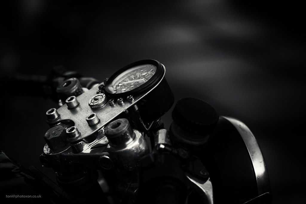
I wish every photo I took looked as good as these, but sady it's not about the gear and I can still make a mess of some pics. :p
When we got back I was generally quite pleased with what I had at first sight, but then came the processing. The Nikon zoom isn't bad, but it's a long way from great too. The original colour images had very soft contrast due to spray and an overcast sky, and the lens also lent a softness simply because it's not dead sharp at any aperture. I felt fairly pleased with the results in Nik Silver efex, but had to push the tonal range and sharpness/structure of the images HARD to bring out textures and and shapes in the rocks, and it's degraded the images a little on subsequent viewing.
This is an example.
I really liked this at first, but there's just too much fiddly stuff in the rocks, and the cloud on the LHS is horribly distracting. Later I ended up running a whole bunch of images through the mono module in Perfect effects but wasn't really happy due to the lack of a sense of crisp, film-like tonality and detail. I wanted everything crisper, crunchier, sharper.
At some stage these images will need a re-visit.
And like I said, there's no substitute for a good lens.
So Sunday we went to Upton House north of Banbury again, and I photographed some of their 1940s office furniture, again. This time I had a nice crisp 85mm prime lens, and immediately on processing I could see the difference. No need to go trying to boost sharpness, no hoofing structure to try to squeeze more detail out. Just simple, tone and exposure control because all the sharpness needed has been baked right in.
And then this morning, as the gales and the rain were coming along I took a picture of Ben's Guzzi, this time with an old, battered Nikon 135 f2.8 AIS manual lens. It was the same story again - no need to go scabbling around for sharpness - it's there already, even though the lens was wide open. And it's also hard to beat the bokeh from a slightly old fashioned telephoto lens that hasn't been stopped down. Just apply some tonal and exposure control and Robert is pater's brother, as they say.
I wish every photo I took looked as good as these, but sady it's not about the gear and I can still make a mess of some pics. :p
Subscribe to:
Posts (Atom)